F37 Britain serif
The Story
A collection of seven colourful, characterful fonts that take their cue from a miscellany of Britishness
What is it that makes something quintessentially British?
That’s pretty hard to put your finger on because the nation’s peculiar visual vernacular comprises thousands of small quirks and nuances. Many of these are so commonplace they go virtually unnoticed — they are around us on the streets, our homes, and objects that we use every day. They are taken for granted, they are just part of the national socio-cultural landscape.
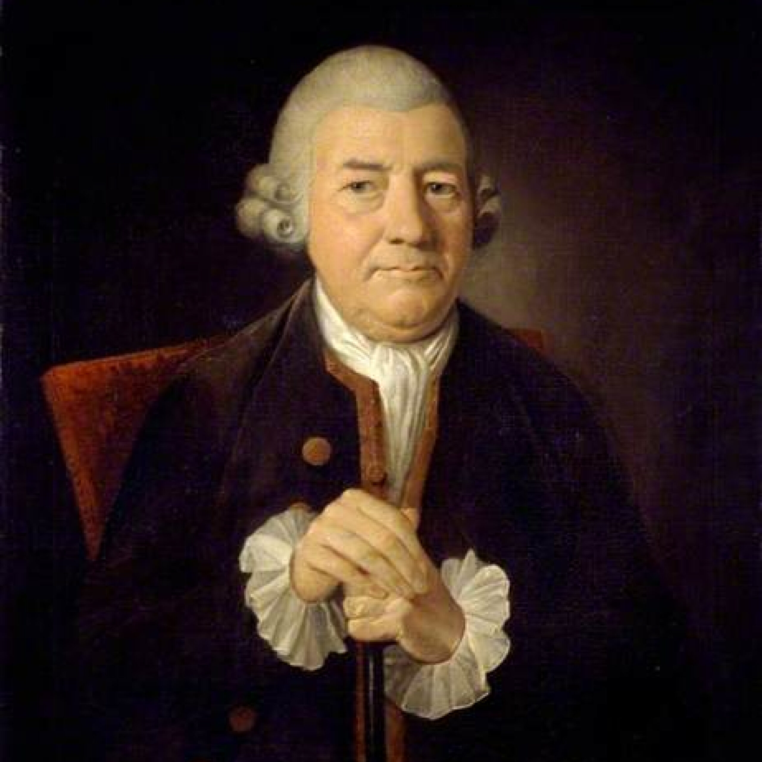
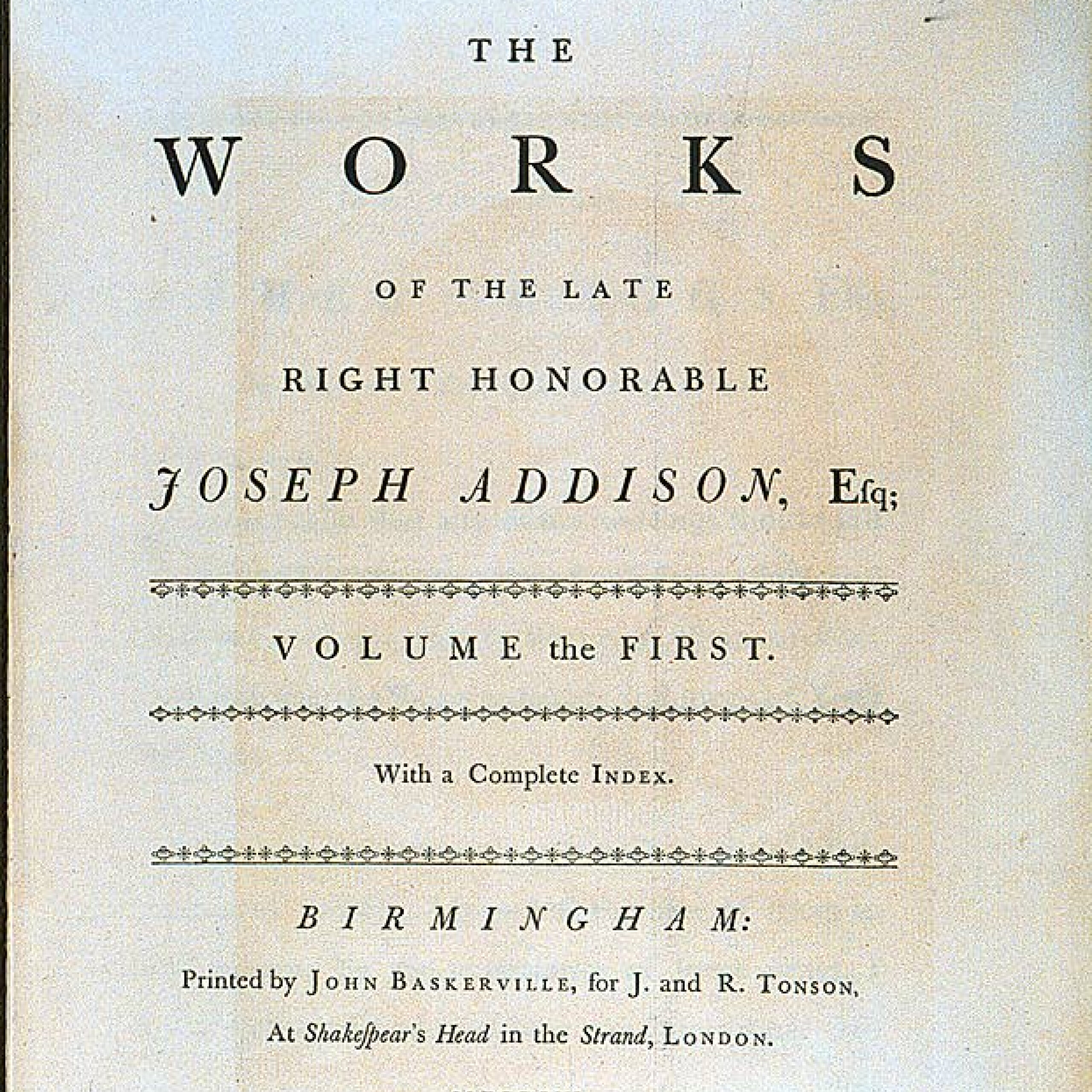
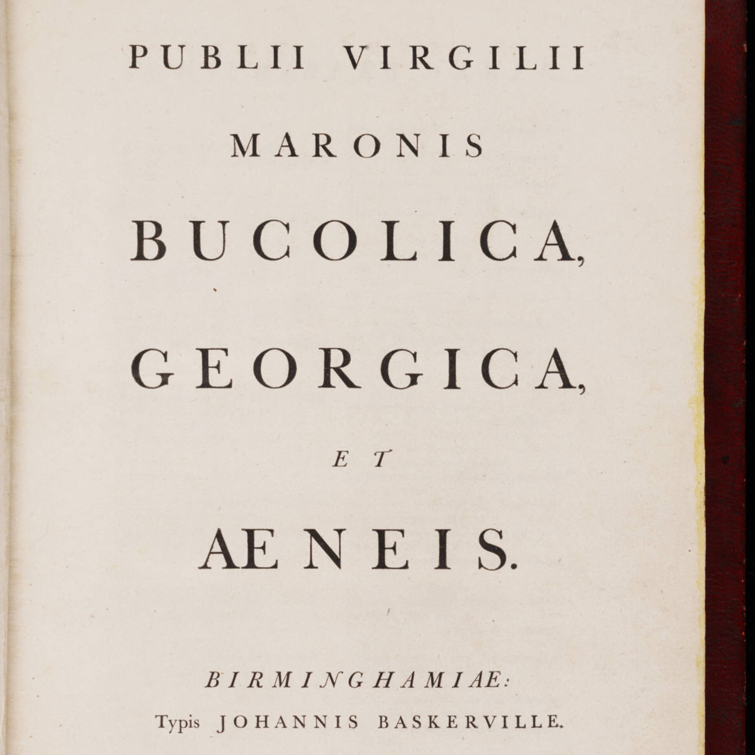
The idea behind F37 British Collection was to create seven disparate but perfectly patriotic fonts. We’ve taken our inspiration from all corners, nooks and crannies of the land; from Victorian theatre posters and antique maps to wood-type specimens and Leicestershire typewriter impressions. We’ve paid homage to John Baskerville, the father of transitional typography and Edward Johnston, the man who took letterforms Underground. We’ve referenced the Union flag and Scotch whiskey, classic serifs, and ever-popular sans serifs.
Together, they reflect the hope and the glory of everyday British life. They celebrate our collective character and eccentricities.
They nod to our past while looking stiff-upper-lipped into the future.
They nod to our past while looking stiff-upper-lipped into the future.
Britain Serif References
F37 Britain Serif has its roots in one of Britain's most iconic designs. Baskerville was first cut into metal over two centuries ago and represents an important step from 'Old-Style' typefaces to modern. This was designed towards the end of the 18th century — hence it's label as a 'transitional' design.

Aa
Italic
Regular
What makes something look typically British? That’s pretty hard to put your finger on.
ABCDEFGHIJKLMN
OPQRSTUVWXYZ
abcdefghijklmn
opqrstuvwxyz
OPQRSTUVWXYZ
abcdefghijklmn
opqrstuvwxyz
ABCDEFGHI
JKLMN
OPQRST
UVWXYZ
abcdefghijkl
mnopqrst
uvwxyz
123456789
!@£$%^&*()
JKLMN
OPQRST
UVWXYZ
abcdefghijkl
mnopqrst
uvwxyz
123456789
!@£$%^&*()